terre d'organ
Turning skeptics into buyers for an organic French CBD farm
00

problem
CBD is a category clouded by doubt. People are curious but hesitant: unsure whether it's legal, safe, or effective, and overwhelmed by which product could possibly fit their situation. For a small organic farm like Terre d'Organ, that creates a double challenge. New visitors don't think in product types — they don't know if they want an infusion, an oil, or a balm; they just know they can't sleep. And before they'll buy anything, they have to be convinced the brand is legitimate. A standard catalogue, organized by product, answers neither of those needs.
solution
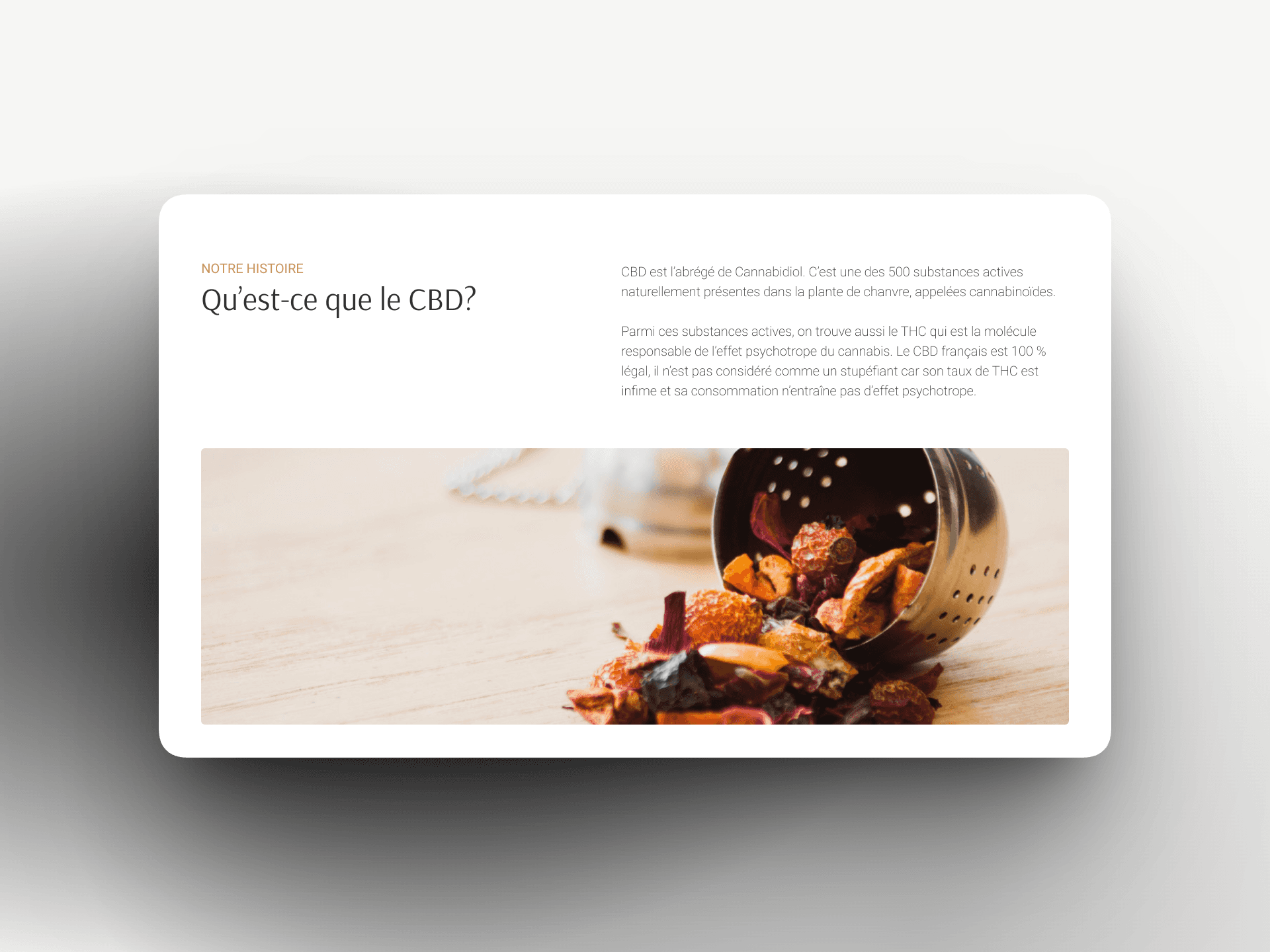
I designed the experience around the user's problem, not the product range. The store lets people enter through their need — sleep, anxiety, pain — and be guided toward the right product, instead of facing an undifferentiated catalogue. And because trust is the real barrier to a first purchase, reassurance runs throughout: organic and French origin, lab testing, certifications, real customer reviews, press coverage, and clear education on what CBD is and why it's legal. Every screen is built to answer, in order, the questions a hesitant first-time buyer actually asks — Can I trust this? Is it for me? Which product solves my problem? How do I buy it?
Terre d'Organ began with a choice: leave the city to grow CBD differently — organic, local, and honest. From a farm in Seine-et-Marne, the founders built a brand that controls everything from the field to the finished product, with French and certified-organic hemp at its core. It's a brand whose whole credibility rests on transparency and trust.
My job was to carry that same trust into the online experience. I worked on this as a freelance designer through my school's junior enterprise, for a real client with real expectations — so the project ran like an agency engagement, from understanding the brief to delivering a usable design. The challenge wasn't to make CBD look appealing — it was to make a curious, skeptical visitor feel safe enough to try.
So I built the experience from research outward: understanding who these buyers are and what holds them back, organizing the store around their needs rather than the catalogue, and making the brand's legitimacy impossible to miss. The result is a store that meets people where they are — with a problem to solve and a healthy dose of doubt — and gently walks them from skepticism to a first purchase.
year
2025
timeframe
3 months
tools
Figma
category
UI/UX
01

02

03


